Sunday, March 13, 2011

Blog #CINCO (5)

I feel like my growth in this class has been a lot. Coming into it I was not too sure if I was going to keep up with it since I only practice Photoshop a couple times my sophomore year of high school.

One:
I feel like the most significan accomplishment in looking at my final project is appropriatly using the patching tool, to airbrush any imperfections that I had. Investigating shots to use in my new Big Idea was quite an accomplishment too. Finding those pictures and capturing them and editing them the way I did could not have been possible if I were still at the same skill level I was at in the beginning of the course. Without the airbrush tools I most likely would not have been happy with the outcome of this pircture.


Two:
One of the more challenging tools to use was being able to blur certain objects and getting the opacity where I wanted it at to make my picture look as good as it did in my head. Fading the opacity was a struggle at first but once I got a better grasp of doing so, I began to use it second hand in the rest of my projects and out of class fun assignments.


Three:
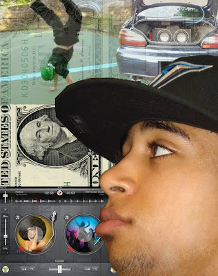
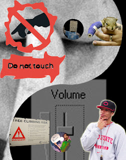
I achieved making meaning in the work of the picture to the left more than the one to the right from making things blend together more. Although I did miss the spot in the upper left corner of the movie project but for the most part I have two seperate films coming together as one to make a new kind of movie. Doing this without adding a whole bunch of pictures and sending the viewer mixed thoughts of what the project could be about, a lot like what I did in the picture to the right.


I came so far from not knowing how to change perspective or copy and pasting correcty to being able to change everything and anything about a single picture to meet my needs. All thanks to Mr. Knochel taking time and patience with his students.

Final Project

My Big Idea is change. To demonstrate this idea i decided to show how the image of the hip hop culture has changed from old school to new school. Let me reemphasize that I used my own pictures for this because that was the influence I was under for this project.


For the Old School picture I brought Eazy E back into the formula because what is old school without the man himself? For the background I have graffiti art to show some rebellious behavior and a major trend that was going on while people related it to hip hop, the graffiti was found on Cleveland Ave. Another thing that is related to old school hip hop is of course, basketball. Not trying to be stereotypical or racist and show a picture of a black man playing basketball so I portrayed my friend Derek as a basketball player and those hoops were from an elementary school that our coach has us preform community service at. In the top right corner you can see a picture of my family friend "Uncle Dave" with his records, that is how it was done in the good ol days when it came to DJing.


In order to show new school hip hop I had to introduce a new face into the game, that new face is me. The only thing all these artist now-a-days seem to talk about is how they are on a "paper chase" so to bring that into my project I set it as my background. Uncle Dave would have some mixed feelings if I were to show him how technology lets you be your own DJ with no hasle of carrying your records with you as long as you have an Ipad (my ubcle is still alive, no worries). The popular dance that is associated with hip hop is break dancing. I snatched a picture of Josh while he was attempting to break dance pretty well. To play the music, its all about who has the LOUDEST sound system, that some how determines who is cooler or something. So all I did was take a picture of Josh's sound system, not going to lie it is pretty cool to be driving around with all that rattle in the trunk.


These pictures are a perfect example of how change happens. The change from Old School hip hop to New School hip hop is obvious from all the aspects of whats important, whats on the artists mind and mostly, the sounds of music.

Blog Cuatro (4)

I thought my last big idea was a good one but after reflecting on it I thought it would be better to go off of something more familiar to me. Last time I feel like I had good pictures and what not but it seemed a little scattered of what my big idea would have been unless I explained it to the viewers. I have always been a fan of music so I think I am going to stick to something to do with sounds of music or something along those boundaries. My Big Idea is how the image of the hip hop culture has changed. To display my big idea I plan on representing old characteristics of the hip hop culture and a newer more stereotypical version on it. Doing all that by taking my own pictures and following the original rubric (From what Mr. Knochel verbally addressed). For visual strategy I like the idea of fading the opacity and merging layers so I am most likely going to do some thing like that for the project at hand. I want to grab the attention of the viewer but at the same time I do not want it to be too overwhelming on him/ her. Some times it is hard to show everything that is on my mind to demonstrate the points I am trying to get apart which makes things look a little cluttered, that will not happen on this project though. I just have to remember that I do not have to use twenty pictures to get a point across. This project could be plastered all over the place and could be used as a wake up call for what is going on in today's music. An example of how some things matter more now than what they did in the "old school" days. I could see this work displayed on BET or maybe even at some hip hop or rap concert showing how times have changed, for both the good and bad.

When I thought of the Big Idea of how the image of the hip hop culture has changed from old school to new school, I immediately thought of graffiti art for the old school part of it. That then triggered the idea to bring one of the more better graffiti taggers, whom I have already talked about in this class, Daim. Old school hip hop is all about tagging and getting your name out there and rebellious behavior, perfect example N.W.A., if you are unaware with this group then you could Google them because I do not feel comfortable explaining it on my blog, or perhaps read Mr. Funk's book, Mr. Funk is the one that really introduced me to the graffiti art work. Daim influenced me by going out and finding any graffiti on campus, I thought it was going to easy but I actually had a hard time finding anything so I had to go off campus and go into the not so wealthy part of Columbus to find something worth posting on my blog.

My goal was to find something/ anything as impressive as that graffiti art by Daim.


You can not say anything about old school without mentioning one of the greats. Eazy E may have been more on the rap side, but all around ties into my Big Idea threory becuase of the rebellious behavor part. So I had to find a way to incoroporate him into the project.


The final thing that influenced me on my project is the material aspect of it all, MONEY. Old school time, people would love to have money but now-a-days all you ever hear about is people complaining about not having enough, singing about it, rapping about it, and most of all, talk about the recession. I thought it would only be appropriate to have money be in the project.


A newer technique I plan on using in this project is most definatly the healing patch tool. I also plan on changing the layers from Normal to Dissolve or any of those cool tools.

Well lets see how it works out!!

Monday, February 28, 2011

Quiz 4


For this project I was trying to take a picture that appeals to the teenage generation, also others attracted to horror, and the other audience I was looking to appeal for are people who are addicted to actions flicks with a GREAT plot. Therefore I transformed the poster of Flight of the Phoenix with the poster of Friday the 13th Jason. The darker part of the poster obviously grabs the attention of people into dark, scary, horror themes. And the outer trim of the poster from Flight of the Phoenix gives it a colorful vibe which makes the movie seem more action-pack. The characters alone could make people want to go see this movie. Sex appeal from the actress, the jock, the smart well dressed gentle man. To pull it all together you have a scary looking lumber jack man in the eye of the mask of Jason, showing how he is the killer since he is behind the mask, kind of like the perspective of a killer.
If this poster were to be a real movie, I would most likely be the FIRST person to buy the ticket.

Monday, February 21, 2011

Midterm Artist Statement

Midterm Diptych Artist Statement
My Big Idea is purpose, sound, identity. When first observing these two spectacular pieces of art your mind may be lost in the amazement of them and don’t worry, that’s all right. But if you look closely my Big Ideas will suddenly pop out at you and grab your attention. You can see the purpose of signs peaking interests and leading to consequences of not obeying. You can witness the power off sound, or no sound. Observe how certain objects identify places and people. Money and time are two huge factors now days so don’t waste a second because time is money. The Big Idea is the foundation of this great country we live in, everything serves a purpose, sound keeps us in unison, and identity makes us whom we are.
Research tactics for this project came from
all the searching techniques that I’ve learned in class from using Flickr.com and Google images, and using specific search engines to find various image sizes.
The Big Idea that I choose is important to me because this is how I see life. I like to think others think like me, maybe not all the time, but I like to think for the most part people see things like me.
It was fun working with all the photoshop tools to make a creation like this.

Sunday, February 20, 2011

BLOG #TRES (3)

I decided to go out on a limb and look up my own pics and flicks for this blog.


Growing up when I was younger and my parents having to work during the day meant that they would have to find a baby sitter. Personally I did not really care as long as I had my Tom and Jerry. Bob Frank the producer and animator for Tom and Jerry back in the good ole days was my hero. I was too young to read or concept everything too very well but I could tell the good episodes from the bad ones because of who the producer was, and Bob Frank was the best.

This appeals to me because the story of episodes are told through sounds and not words. Its inspiring to many people because no matter what what age, or any race can understand and follow the story through the sounds being made to represent the actions of the characters. As of now its obvious that this show describes the Big Idea of sound.

What began to trigger my curiosities of this show as of lately is how Bob Frank continued to think of different material to use to make noises for certain actions, and what the noises were created from. Also how he thought of most the episodes from the beginning to the middle to the end and how it all ties together to show a moral to the story. That's one of the reasons why my babysitter allowed me to watch, one, she liked to watch it(on the d.l.) and two, it taught lessons so all she had to do was sit me down in front of the t.v. and wait for my parents to return from work.
I was inspired by Bob Frank to make great stories as he did, but after I saw how episodes were created, clip by clip by clip I said it was too much work and my artistic skills were not up to par to do some thing like what he did.

The artist taught me how to interpret sound into a piece of work. Bob Frank inspired me to use all sorts of colors and sound in my final project.


http://www.google.com/imgres?imgurl=http://i.ytimg.com/vi/0HCZoPdzjoc/0.jpg&imgrefurl=http://www.dipity.com/timeline/Yankee-Doodle-Dandy/&usg=__Go0eQO3RGZ4mi90Hr9XGPKEH34k=&h=360&w=480&sz=11&hl=en&start=0&sig2=wHLv0AcNN606Tgpaxux8lw&zoom=1&tbnid=XVC0uzchDlrRkM:&tbnh=158&tbnw=211&ei=VM5hTYa0G5LegQeD8pXJAQ&prev=/images%3Fq%3Dbob%2Bfrank%2Btom%2Band%2Bjerry%2Bpics%26um%3D1%26hl%3Den%26biw%3D1680%26bih%3D832%26tbs%3Disch:1&um=1&itbs=1&iact=hc&vpx=846&vpy=547&dur=3547&hovh=194&hovw=259&tx=152&ty=121&oei=VM5hTYa0G5LegQeD8pXJAQ&page=1&ndsp=32&ved=1t:429,r:28,s:0


http://video.google.com/videoplay?docid=-8477894486559849099#


I was never a bad kid growing up but some times I did catch myself in trouble after drawing on things that I wasn't suppose to haha. My art ed. class from last quarter involved a section on tagging which really sparked my interests. Again, I've never been a Picaso or anything like that but I do like to draw and freehand things and once I saw what Daim was about I thought he was very talented!

Daim's work is so appealing because it can really grab your attention and twist your mind. It's almost as if his work pops out of the wall.

His work is so inspiring. We saw a documentary about him and how he has all these followers starving to be like him and join the group.

The Big Ideas being expressed are identity, because in almost all forms of graffiti the artist will leave a signature on his artwork(although it is illegal to do what they do).
I will use an open mind on my final project, because that is one thing that I have learned from Daim, and from doing so he has became a huge inspiration to many people all over the world.


http://www.youtube.com/watch?v=XLikgptMD98


http://www.google.com/imgres?imgurl=http://img59.imageshack.us/img59/7664/daim9df.jpg&imgrefurl=http://www.inthemix.com.au/forum/showthread.php%3Ft%3D143636&usg=__CBmCbxHU2L2T_eBdZikZaYAGgCI=&h=375&w=550&sz=35&hl=en&start=28&sig2=6YaE_6ErfRne0AD0_AHQqw&zoom=1&tbnid=-IZlHUvnmiNNXM:&tbnh=149&tbnw=199&ei=mtFhTbXXEse9tgej17yjDA&prev=/images%3Fq%3Ddaim%2Bgraffiti%26um%3D1%26hl%3Den%26sa%3DN%26biw%3D1680%26bih%3D832%26tbs%3Disch:10%2C559&um=1&itbs=1&iact=hc&vpx=549&vpy=556&dur=483&hovh=185&hovw=272&tx=170&ty=125&oei=lNFhTZPZBoGRgQf_qv3CAQ&page=2&ndsp=30&ved=1t:429,r:17,s:28&biw=1680&bih=832
Wednesday, February 16, 2011

Big Idea #2 Part II

/Network/Servers/home-2.arts.ohio-state.edu/Volumes/arts-home-2/home2/reineck15/Desktop/Blog#2.psd

FINALMENTE!! That's spanish for finally, after being unable to to upload my blog picture many, many times I have managed to drag the picture from the desktop to this blog. Hopefully it uploads correctly because after all this time of trying is kind of wearing me down. Thanks for waiting though! Although there is one trick behind it, you have to go to the link above then open it up to see it.